Graphing Worksheets
How do graphs Help us? Graphs are visual representation like charts. Such visual representation helps in understanding a data more efficiently and quickly. When an effective graph is shown, the data is represented gains clarity and expresses more authority. They are use in algebra as a way of plotting diagrams, lines or functions in a visual manner. This helps generate a clearer sense of what the function indicates like function of a parabola, hyperbola, straight-line or a curve. Learning to do create, read, and interpret them has several major implications in real world. They are used in several professions such as: mapping floors, designing a building with accurate measurements or even making an engineering project. They are often considered difficult to understand making it difficult for students to learn. Commonly, graphs are used on a cartesian coordinate system where there are two variables that are used x and y. The values of x are assumed in a function and it automatically generates the values of y. All the points that are plotted on the graph paper, makes it a function indicated by a line. You will also find a number of worksheets some people consider graphing sheets in our geometry section. This is a huge collection of worksheets that show you how to create, read, interpret, and make decisions based on all types of graphs.
Printable Worksheet Topics
- Creating Pie or Circle Graphs From Data Charts - You will not only be shown how to create them, but also how to spot trends from them.
- Analyzing Functional Relationships by Graphing - We analyze the concept of best fit and directly proportional relationships.
- Coordinate Graphing and Position - How to set them up and what does a single ordered pair signify.
- Coordinate Planes - We have all known this concept since we played our first game of Battleship.
- Graph Paper - Over 100 different forms of graph paper for you to print.
- Graphing Data Sets - We explain what a data set stands for and how to choose the type of graph to best display it.
- Graphs of Proportional Relationships (Basic) - These types of relationships between data will result in the formation of a straight line.
- Graphing Proportional Relationships (Moderate) - The data sets that are presented here are a little more difficult to translate.
- Graphing Real World Math Problems - Welcome to the life of being an engineer.
- Horizontal Bar Charts - This is usually the first type of bar chart that students work with.
- Interpreting Pie or Circle Graphs - Students should have a good understanding of percentages before they work with these worksheets.
- Line Plots That Display Data - We use graphs to make fractional adjustments.
- Make Graphs That Represent Data - This is the first step in understand the concept of a graph and what it can do for us.
- Making Bar Graphs - Data sets are provided for you. You will just put them all together.
- Making Pictographs - You can use objects on the graph that make sense to you and your readers.
- Picture Graphs - What are they? How to create and read them. These are helpful tools for you.
- Plotting Line Graphs - This helps us predict points and trajectories. They are also very helpful for breaking down maps.
- Pythagorean Theorem On Coordinate Systems - This helps use predict where new points with land.
- Organizing and Understanding Data - We show you how to arrange data in an understandable manner.
- Quadrants - This gives us the basic understanding of where an ordered pair lies within a coordinate plane.
- Reading Bar Graphs - How to make sense of the data that is displayed and use them for comparisons of data sets.
- Reading Data Tables - We look at simple and complex forms of data tables.
- Reading Line Graphs - What does a line graph tell us and what does it mean?
- Tally Charts - A key tool for keeping track of observations of data.
- Using Coordinate Graphs - Why would you use them and what can they help us do?
- Using Graphs To Solve Real World Problems - How to model situations and scenarios using a graph to help you better comprehend them.
- Understand Signs of Numbers in Ordered Pairs - What does a negative or positive value indicate?
What Are All the Different Types of Graphs and What Are They Used For?
If you visited a few topics above, you quickly realize all the different applications of this skill. We always start by learning to read them, then we learn to create them, and then we learn to interpret them, and it leads us to making good decisions. Yes, bar, line, and pie format apply to pretty much everything. Pictographs are often used to visualize a simple statistic to make it more real for the audience. There are particular types of graphs that are lend themselves to certain industry sectors. Scatter plots are often used in the Science and Technology industries to see if a relationship exists between variables. Function plots and binary decision charts are heavily weighed in this industry as well. History is recorded and retold with the use of timelines across just about every conceivable industry and walk of like, for that matter. Tree diagrams that can be used for relationship charts are to explore hierarchy from the Royal family to organizational structure of most Fortune 500 companies. We are starting to see stacked line charts begin to adhere itself to many industries as of late. This is helpful when you are trying to compare many sets of data over time. One of the most confusing types of charts is the stacked bar graph. This is starting to gain traction with a younger generation, and you can expect to start seeing them in the corporate section regularly in the near future.
We will take a look at the 4 most commonly used form of graphs.
Line Form
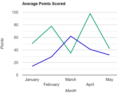
This displays a series of data points that are connected by a line. The x-axis is a list of the categories of the data. The y-axis represents the measures of the values we are focused on. These are used to track moderate to sizable changes over time. You can also place multiple line on the same graph to compare and contrast the progress of multiple things. These are one of the more frequently used forms of graphs and they are very helpful for comparing two variables. They also work very well when we are looking at historical time periods.
Bar Form
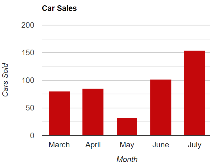
Great for comparing things between multiple groups. These are also used to track things over time, but they lend themselves to displaying shorter time periods and greater changes then you would find within its line counterpart. The way in which they display data makes it very intuitive and the data and the purpose of the comparison are easily understood by others. This is why you will see used by many different periodicals.
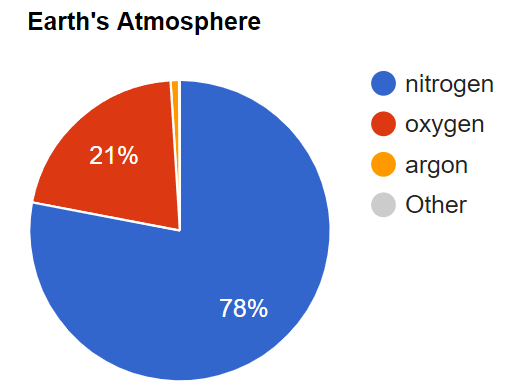
Pie or Circle Charts
These are very versatile, but what they do they do an excellent job of. We use this form to display the composition of something. For example, we can see the composition of the elements that are found in Earth’s atmosphere in the example to the right. As you can see, they display proportions of a whole. The larger the percentage of the whole value, the larger the slice. The smaller the percentage of the whole, the smaller the slice.
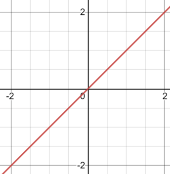
X-Y Coordinate Plots
These are used to determine if a relationship exists between two things. Each direction of the x-axis (left to right) and y-axis (up to down) represent a single variable. If the variables increase over time, it means that they have positive relationship this means that they are in sync to one another. If they go in opposite directions meaning that one goes up as one comes down the relationship is called negative. There are many instances where the data does not follow a pattern and therefore no relationship exists.