Reading Bar Graphs Worksheets
These types of graphs are great for showing changes to something over time. They are great for summarizing large data sets in a visual format. The length of each bar indicates the quantities relative to each data point. The larger the bar, the greater the magnitude of that data point. This form of data visualization can help us make educated decisions based on the data that we have available to us. Bar graphs help us get a general understanding of the trends that are in front of us. They do not help us spot causes or effects, they are often not helpful to spot patterns in data. In this section we will learn how to make sense of data that is found in this form. These worksheets and lessons will help students learn how to interpret and make decisions based on bar graphs.
- Food Likes Step-by-Step Lesson- It seems like this topic is a recurring theme in all of our graph worksheets.
- Guided Lesson - A survey on test scores that show that Science and French are not student's strong suit.
- Guided Lesson Explanation - Follow the length of the line and then convert it to an integer that we can make sense of.
- Practice Worksheet -We start with a question about social networking. I just started on Facebook and Twitter myself, so it was fitting.
- Matching Worksheet - This was a bit of a funny poll. People with last names that are five letters or less. Thought of it at Starbucks while talking to Greg Ginn and Kerri Mitt.
- Double Bar Graph Lesson and Practice Sheet - At first this really challenges kids, but then they pick it up fast.
- Double Graph Worksheet - More practice with the double segments of data.
- Reading Five Pack of Worksheets - Pretty straight forward data analyzing. You should explain to kids why census data lags so far behind the times.
- Leveled Lesson and Worksheet - This type of bar graph really frustrates many kids. Make sure they get practice with it.
- Leveled Graph Worksheet - This is a good level bar graph starter worksheet because it only contains two levels.
- Answer Keys - These are for all the unlocked materials above.
Homework Sheets
Is this some big popularity contest or what? I guess it is!
- Homework 1 - We would just add the value to all of the data sets.
- Homework 2 - In a survey children were asked about the TV channels they watched. This chart shows the data of the survey. Study the graph and answer the following questions.
- Homework 3 - Children were asked their favorite ice cream flavor. The flavors of the ice cream are shown below in the bar graph.
Practice Worksheets
Politics is strange, it's the only time popularity doesn't matter in a survey.
- Practice 1 - Find the total numbers of accessories sold by both shops.
- Practice 2 - In a school, a survey on students was done. The survey asked students which personal nature they most identified with.
- Practice 3 - A survey was done with 2 groups. According to bar graph, answer the following questions.
Math Skill Quizzes
I followed a common theme on each sheet. I just couldn't fit clip art.
- Quiz 1 - Which shop sold less stationery and what is the lowest rate?
- Quiz 2 - Which sweet did the shops sell the most of?
- Quiz 3 - Which vehicle is preferred most to ride?
What do Bar Graphs Tell Us?
Perhaps the most common statistical display used to represent categorical in an organized manner, where the length of bars clearly shows quantity and makes it simple to compare a difference in amounts. A bar graph focuses show on compare singular data points. It is not super helpful for identifying relationships between data. An example that can be represented as bar graphs would be; How much money people in the US spend on transportation services to commute into work every year.
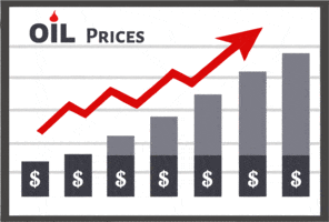
However, the matter of concern here is what do bar graph tells us? Well, this visual tool uses varying lengths of bars to compare the data of different categories, represented on any of the axes i.e; x-axis or y-axis. These tools mainly tell us the following few things: It effectively compares items between groups. It shows the trend over a definite period of time, say quarterly, one year or four years. It also sees the annual trends of sales distributed throughout the year. Using this tool tells us about a significant change in data over-time. For example, take a look at the visualization of oil prices to the right. This clearly indicates a trend of failing process. They are helpful for spotting trends, but they do need to be a bit more obvious.
In addition to the above-mentioned points, this tool makes it easy to compare complex data in a glance. It indicates specific data categories in a frequency distribution. I find them very helpful for understanding where something is headed. For example, when taking a look at the oil chart, it would indicate to me that it is a good time to buy oil.
The Advantages to Using Bar Graphs in Your Explanations
When you are communicating your conclusions and explanations to an audience these can be powerful tools to help you qualify your position. Writing an explanation down on paper or vocalize it can often be validated with the help of these visualization instruments. They are specifically helpful with large pools of data. They will help your audience comprehend your thought process. Since this is the most primitive or basic form of visualizing data, most people will quickly pick up on it. This is also one of the most widespread used graphics, so most people are accustomed to reading these types of charts. They are really helpful for identifying underlying trends in your data. This skill is often used to help identifying preferences of customers in the business world. To improve the effectiveness of your data we suggest using visualizing every little aspect of the data. This can be done with the help of labels and clearly stated legend. Many different computer programs can make this a quick reality for you. You would just need to provide the program with a column or row of data. We highly suggest that you learn how to master the use of a spreadsheet prior to graduating high school. Whether you decide to enter the workforce or head to college this will be vital skill to help you understand just about an data source you are evaluating.