Interpreting Line Plots From Word Problems Worksheets
What Are Common Forms of Data Charts and Line Plots? Data Charts are visually used for data representation, and they help in condensing large amounts of information into a much more manageable format. There are four main types of data are charts are also used very commonly: Bar Chart – The values are indicated through the use of bar in their corresponding measured group. These bars can be used both horizontally and vertically. Vertical charts are called column charts. When you have too many bars to plot, horizontal bars are an effective way to do it. Line Chart – Line chart is a more continuous form of data representation and shows value across different measurements. This type of chart shows the rise and fall of values more effectively. Line plots are used for collecting information using dots. It is one of the simplest ways of displaying data. Line plots are also called dot plots. Different types of plots are: Scatter Plot – a scatter plot shows values on two different axes: Y and X. They are a versatile representation of data and shows the correlation between variables Box Plot – this plot uses whiskers and boxes for summarizing the value distribution within measured groups. The whiskers or the box represent the area where the data lies. These worksheets help students learn to create their own data charts and line charts in response to word problems.
Aligned Standard: Grade 2 Measurement - 2.MD.9
- Step-by-step Lesson- You are asked to make a basic line plot from the data chart you are given.
- Guided Lesson - Plot three different line plots based on three different scenarios.
- Guided Lesson Explanation - I spaced out all the line plots in such a way that they are clearly seen.
- Practice Worksheet - You are now asked to interpret line plots. Complete all the problems. Make sure to draw pictures to help you solve the problems.
- Matching Worksheet - Match the data charts to all the line plots. Write the letters that match the data set.
- Answer Keys - These are for all the unlocked materials above.
Homework Sheets
We work on line plots, the first step in making the transition to a pictograph or bar graph.
- Homework 1- Sherry bought 10 kg of vegetables in three days. She kept track of how many kilograms of vegetables she bought each day.
- Homework 2- A shop sold school bags for 3 days straight. Make a line plot based on the data chart.
- Homework 3- A sports shop sold cricket bats for 4 days straight. Make this data come to life.
Practice Worksheets
More line plot situations here for you. The problems that are presented here are a bit more abstract and will require you to think in a different direction.
- Practice 1- Analyze the graph and write the number of blocks that are on day one.
- Practice 2- A book shop sold the new Elite Shadow book and tracked the sales over the first four days. Make a line plot based on the data chart below.
- Practice 3- A cell phone distributor was selling new iPhones by the case. They tracked their sales for the first 5 weeks. Make a line plot based on the data chart below.
Math Skill Quizzes
We really start to see how they are doing with this skill here. The exercises that you will find are more compact and filled with information.
- Quiz 1- Jacky bought 5 chocolates in four days. He kept track of how many chocolates he bought each day. Make a line plot based on the data chart.
- Quiz 2- Steve bought 9 burgers over three days. He kept track of how many burgers he bought each day. Make a line plot based on the data chart.
- Quiz 3- The watch shop sold the navigator watch for 4 days straight. They tracked sales. Make a line plot based on the data chart.
How to Understand What a Line Plot Tell Us
Line plots are one of the simplest tools out there that help display raw data. We can use them to make sense of word problems. They help us quickly visualize what is happen in the problem. This can help us make educated decisions. See this in action in the word problem below:
Word Problem: Nancy played basketball at West Brook High School. The line plot below shows the points she scored in each game over the course of her season. Determine all the things that this tells us about Nancy's basketball season.
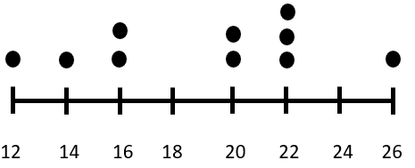
This line plot has 10 data points. That tells us that Nancy played in 10 games. The highest number of points she scored in a game was 26 and the lowest number of points she scored in a game was 12. She most frequently scored 22 points per game. The last basic question it answers for us is how many points she scored over the course of the season, just add up all the points that are represented by the dots. Which would be 190 points in total. In future lessons we will learn how to statistically analyze this type of data, but this a good place to start understanding raw data.