Displaying Data Worksheets
There will be many times throughout your life that you will collect data and then attempt to make sense of it. Are those two things related? What has changed in this situation over time? Does that thing really work? These are all common questions that a simple data analysis can give you an answer to. This helps you spot trends and outliers of those trends. When we want use values to tell us a story it often helps tremendously to visualize the data and make it into graph or chart. When this is done effectively it makes it easy to see correlations and make great decisions from the information that you have put together. In this collection of worksheets and lessons, students are given a wide array of data displays and they are asked to make sense of them.
Aligned Standard: Grade 6 Statistics - 6.SP.B.4
- Simple Data Step-by-step Lesson- We have you create a simple display of single digit numbers.
- Guided Lesson - This just reminds me how all of the new careers that have popped up in the last decade are all focused on data.
- Guided Lesson Explanation - The displays could be done in some many different ways. The examples I show are common answers to the core curriculum questions.
- Practice Worksheet - This one will probably take you a while to complete. Take your time!
- Matching Worksheet - Quick interpretation of data sets.
- Answer Keys - These are for all the unlocked materials above.
Homework Sheets
A key skill for students of all levels. When students have graphing issues, I send them here
- Homework 1 - Thirty students got a science project that had a top score of 50. They are divided into six groups of five students each.
- Homework 2 - In a library the teacher recorded the study times of students who arrive at the library to read books. The following data was collected over a 2 -week period (study times are in minutes)
- Homework 3 - The histogram below shows the level of cholesterol (in mg per dl) of 200 people.
Practice Worksheets
I tried to make sure that students would see all types of formats here.
- Practice 1 - There are 40 students in a drawing class. Students have been given a task to draw as many circles as they can make in 5 minutes.
- Practice 2 - Many people are suffering from cancer. The data shows the number of people that died from cancer in each city.
- Practice 3 - The teacher asked the class about their favorite activities.
Math Skill Quizzes
These quizzes take a bit more time than the typical quiz students are conditioned to.
- Quiz 1 - A hot dog cart decided to count their number of sales over 7 days.
- Quiz 2 - George asked his employee which type transportation they used. 25 people traveled by car, 30 people traveled by bike, 45 people walked, 15 people traveled by train and 40 people traveled by bus.
- Quiz 3 - 20 students completed their science projects. Their scares are displayed in the graph given below.
Tools for Displaying Data
To describe some social and physical phenomena, people collect, analyze, and display relevant data. After you have a plethora of data, the most important thing is to present it in a manner that gives it more meaning and sense. This is where you must use your intellect and analysis skills to find out the perfect way to display data. The best tool depends entirely on your purpose for the analysis and the audience you are working with.
There is a wide array of different types of data displays; tables, charts, and all forms of graphs as well as line plot methods. The only decision you have to make is to which one to choose to display your data. Some of the more common types of data displays include:
Bar Graph - Use it to display data comparing numerous items or ideas. It also allows us to track progress or changes over time.
Histogram - These data displays look very similar to bar charts, but they serve a different purpose. Use it when you have to show the frequency and compare more than one item or idea; each bar represents an interval of values.
Line Graph -Much simpler than the other graphs, use it when you have a problem showing a change in time. They can be used to track short or long time differences.
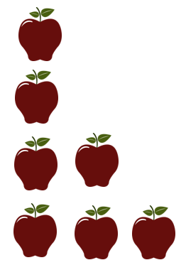
Pictograph - One of the simplest ways to visualize data. The chart defines a variable by an icon and the number of times that the icon appears indicates the value of the data. This is to use when you have different ideas and items to compare.
Pie Graph - A word problem that wants to display percentages of a whole, requires to use a pie chart. This display data as a percentage or part of a whole. This is a great way display how much of a certain variable contributes to an entire system.
Scattergram - Use it when you have to determine a correlation between quantities. It shows how strong or weak the relation is. Also used to compute line or curve of best fit. The end goal of this display us to observe if there is a relationship between two variables.
How to Quickly Improve Your Message With Any Chart or Graph
You want to deliver them to help you craft a narrative that will resonate with your particular audience. If you audience is younger people, your display should match their level of understanding. If you have a more sophisticated crowd, you can use more complex visuals. Remember that the goal is to tell a story that is presented as simple as possible. Anyone viewing it should be able to quickly grasp what it is attempting to communicate with them. Do not distort your message by putting forward anything that distracts readers. Do not over explain anything ever. Simple labels and legends that they understand is what you want to present. A simple tweak of a title or label can go a long way to help you achieve your goal. It is always helpful to present a zero baseline, but if your values do not feed off of this it can be helpful to truncate your display. Pick a format that highlights changes in the data. Sometimes pie charts are not helpful to signify subtle differences in values. It is also helpful to highlight where changes exist you can do this with a call out or highlighted area. Stick to singular colors to represent the same variables within your visualization. Avoid using patterned colors or too many colors as they can confuse people. The last thing to do is to make sure everything is put in well defined geometric shapes. This makes your audience much more comfortable when they see something that they are familiar with.