Interpreting Data Worksheets
Collecting data holds a great deal of value. It helps us learn more about just about anything. If you wish to make better sense of anything you need to interpret what the information is telling you. There are several steps that we take to make sense of everything. We start by gathering the information and constructing a tool such as a graph or chart that will help us make an assessment. We then look for relationships that may exist between the data. If we spot a trend, we can make recommendations based on this. Each of these steps is ridiculously important. If we make a single misstep in this process it can lead to false conclusions. These lessons and worksheets will help you understand how to break down a data set and make sense of it.
Aligned Standard: Grade 6 Statistics - 6.SP.A.3
- A Piece of Cake- Use the sales ledger from the past four weeks of sales at Rose's bakery to answer these questions.
- Fishing for Answers! - We make sense of the weight of the fish caught at a local fishing derby.
- Sure Temperature - Researchers are trying to see patterns in the weather data of 3 days.
- TV Time - One thing is for sure! Ashley's family watches way too much television.
- Magnificent Magazines - A magazine sales fundraiser tally is in. Who was the best salesperson?
- Answer Keys - These are for all the unlocked materials above.
Stem and Leaf Activity Sheets with Answers
Students first create the stem and leaf plot. Then they use it to answer questions. This is a great way to see how stem and leaf plots help us make sense of data quickly.
- Camp - Jerry did jobs around the community to earn money to attend basketball camp.
- Rope Jumping - Martha loves to jump rope. She has been trying to see how many times she can jump before tripping. Here is a list of her consecutive jumping attempts.
- Cookies - Rita baked cookies for a school bake sale. She made many batches. Each time she tried a new recipe she kept track of the number of cookies each recipe made.
- Cars - To pass time while on a trip, Paul counted red cars seen each day while on the highway.
- Runner - Gilbert ran a quarter mile with these totals for minutes one week.
Tips on Interpreting Data
Analyzing vast data sets and series of data can take a lot of time and effort. There are a number of ways that you display and organize data to make it much easier to work with and as a result interpret. Interpreting data to make solid and well-planned decisions is the key to success in many different walks of life. When we analyze quantitative information, we are working with undisputable facts that can use as proof that something is or is not working. This proof helps us makes generalizations that we can use to improve ourselves, companies, teams, and organizations.
Statisticians introduced several ways through which large data can easily be summarized and interpreted. Regardless of how a stream of data is being displayed or presented to you, there are some key features that you are going to want to focus on for an increased chance of success.
Start with organizing the data. There are several ways you can do it, such as ascending order and descending order, which is the most common way. Represent the information visually in the form of graphs, line plots, stem-and-leaf plots, bar graphs, histograms, pie charts. Which graphic tool best depends on the purpose of this display and the audience you are sharing this with. Begin with labelling everything properly which means that you must not only focus on the values, but what they represent. This includes the measurement units which can be as simple as dates or as complex as compressed fluid units.
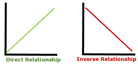
Once your visuals are in place and you are satisfied that it is arranged in a manner that will allow you to learn more, start analyzing all the values and look for trends. Is there any type of relationship in the values? You can find this by looking at the trend of the line. Line graphs are great for finding relationships between two variables. If the two variables are doing the same thing such as if one increases so does the other, we call that a direct relationship. Direct relationships can also go in the opposite direction where if one decreases, so does the other. If the values of the two variables seem to be doing the opposite of one another, we call that an inverse relationship. This will be displayed by as one variable increases, the other decreases. You can see an example of how this would look on a line graph below.
Your next step is to work out measures of central tendency that are called mean and median of the data. Mean is the average of the data, and the median is the central value of the data. You can also work out the variance and standard deviation which is a measure of how tightly or widely the data is spread in a data set. This helps you determine if your data is even valid. These measures give an idea of how spaced out your values are. If there is a really high level of variability, you may need to collect even more data. Always remember that you can never have too much data. The more you collect, the more valid your experiment.
If you are working on a free experiment you have to remember that no answer can be your answer. If you are looking for a relationship and you cannot determine that a relationship exists between variables, that tells you that these two variables have no relationship. That means that you are going to want to identify other variables to see if you can manipulate them for your purposes.