Stem and Leaf Plot Worksheets
When we have large pools of data it often makes it much easier to collect and analyze when we follow a pattern of sorts. Up until now you have been using raw data charts which can definitely get bulky and require a lot of space to display. We are introducing to a way to make these data sets flow better called Stem and Leaf plots. Just like a stem, we place the highest place value that all the data as a stem and the lowest or lower place values as the leaves. These are used for relative smaller data sets. If you are working with values that have an extreme range, stem and leaf plots may not be the best option. These worksheets and lessons will help students better understand how to create and read stem and leaf plots with relative ease.
Aligned Standard: Grade 6 Statistics - **Related to 6.SP.A.2**
- Officer Trout' s Step-by-step Lesson- Officer Trout's supervisor wants him to create a Stem and Leaf Plot.
- Guided Lesson - See how Mr. Tate's latest science quiz turned out!
- Guided Lesson Explanation - I used a highlighter and italics to point out where changes are made in this one.
- Practice Worksheet - In this version we provide the stem and leaf plot, you provide the answers to the questions.
- Taking Mom to a Mother's Day Dinner - We tie Mother's Day into this topic.
- Advanced Lesson - What do you do when all the data ends in the same terminating number? Terminate it of course!
- Answer Keys - These are for all the unlocked materials above.
Homework Sheets
The first one has you create plots. The second version has you interpret plots.
- Homework 1 - Make a stem and leaf plot for the data sets below. The first one is completed.
- Homework 2 - This stem and leaf plot shows how long (minutes) it took each student in a class to complete a homework assignment.
Practice Worksheets
Here is a boat load of practice for you.
- Practice 2 - Mr. Raines gave a very difficult math test to his class. The scores of the students are displayed in the stem and leaf plot.
- Practice 3 - This stem and leaf plot shows the number of slam points scored by different players in a table tennis league.
- Practice 4 - This stem and leaf plot shows the number of goals scored by players on the Crunch hockey team.
- Practice 5 - This stem and leaf plot shows number clovers found by students during a clover picking study.
Math Skill Quizzes
The quizzes are a really good measure for this grade level. The first quiz is pretty difficult.
- Quiz 1 - Explain this data set by using the technique that we showed you here.
- Quiz 2 - What is the range of data set? You can just run it through all the different sets you have.
What Are Stem and Leaf Plots?
Learning to display data in the form of charts, plots, and graphs is an important concept in mathematics. The applications of graphs, plots, and charts in the real world are innumerable. They are even used by multi-national companies, educational institutes, studies and research, and also on the federal level. We visualize data to make it more digestible, easier to work with, and recognizable.
There are a variety of different ways that you can use to display data such as bar graphs, pie charts, histograms, line plots, and stem-and-leaf plots. When studying plots, the stem-and-leaf plots is one of the easiest and most useful tools to help you quickly sum up larger data sets. In a way it helps streamline the data for you and can make it much more compact. It is a special form of table that requires you to split the number into two parts: a stem and a leaf. The first digit in the number is the stem, and the preceding numbers are its leaves.
Let us take the example of the number 57; the first digit 5 is the stem, and 7 is the leaf of this number.
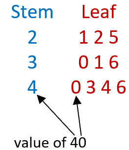
Consider the following data set: 21, 22, 25, 30, 31, 36, 40, 43, 44, 46
We can remove the tens place value as the stem and list all the tens places (2, 3, 4) that are in the stream vertically. We then order the ones place value as leaves horizontally from the in sequential order left to right. Take a look at how 40 was broken up in this stem and leaf plot below:
What are Stem and Leaf Plots Used For?
These display charts are really helpful to analyze data sets to identify the frequency of a particular data point. When you have huge gobs of data and need to give them a good level of structure, these become very helpful. They relate directly to your standard bar graph because normally the larger the bar, the more frequent a data point appears, but if you have really scattered data bar graphs become too cumbersome. No one would want you to have a bar graph with twenty or so bars on it. The one drawback of using these charts is that often the individual data points get lost in the mix and are a little more difficult to communicate with this method. You find that this type of notation is often used in situations where a ton of data needs to be recorded and analyzed. A good example is when a baseball pitching coach is evaluating his pitchers. On average, amateur pitchers will be able to throw seven different types of pitches (curveball, fast ball, change up, etc.). Over the course of baseball game, a pitcher will throw nearly one hundred pitches. This type of notation lends itself directly to this type of data analysis.