Box and Whisker Plots Worksheets
A set of data in statistics is a collection of measurements modified in some way and treated as a group. Statistics is the field of study that analyzes and organizes data, often in sets. There are statistical techniques to work with this information such as mining, triaging, and visualizations that provide clear insight into an informational set. The whole point is to help us make sense of the data and gain some insight that will help us make better informed decisions. Sets often include numerical, categorical, or text data. Examples of statistical concepts include frequencies, measures of central tendency, box and whisker plots, variance, standard deviation, estimation, correlation, etc. A box and whisker plot is a quick, easy-to-read statistical process that is often used to represent the distribution of measurements. It is a tool used to give life by visualize numerical data in two dimensions. Moreover, it shows information about a continuous variable in two ways: by the range (the maximum and minimum values) and by stem-and-leaf displays of the data. This series of worksheets and lessons will explore how to create and evaluate box and whisker plots to help you make sense of a variety of data.
Aligned Standard: HSS-ID.A.1
- 9 Step-by-step Lesson- I give you nine simple pieces of data and ask you to generate an entire box and whisker plot for it.
- Guided Lesson - Time to interpret a premade box and whisker plot. Students will determine the median, lower and upper quartiles.
- Guided Lesson Explanation - I explain it and add the visuals too. We get many thankful people emailing about this one.
- Practice Worksheet - I give you a single box and whisker plot and ask you every question I could possible think of. There are a lot of them.
- Matching Worksheet - It is a fun match the value to their label activity. We look at many different measures here.
- Box and Whisker Plots Five Worksheet Pack - Warning! You will need a lot of scrap paper if you plan to do all five worksheets.
- Answer Keys - These are for all the unlocked materials above.
Homework Sheets
We work on understanding and reading a set box and whisker plot.
- Homework 1 - Find the median (middle number): Median = 1/2 (n + 1), n is the number of values (9) 1/2 (9 + 1) = 5 or 5th value.
- Homework 2 - The median is denoted by the middle number of the boxes.
- Homework 3 - The lower quartile is start of the left box and the upper quartile is end of the right box.
Practice Worksheets
These sheets were spaced well to be used along with your students.
- Practice 1 - Order the figures and find the range.
- Practice 2 - Use the box and whisker plot to answer the questions below.
- Practice 3 - What is the median, lower quartile, and upper quartile?
Math Skill Quizzes
Look close at you might find some very unique questions for your students.
- Quiz 1 - A common question for you: What is the minimum value?
- Quiz 2 - What percentage of information is located between the lower quartile and the median?
- Quiz 3 - Draw a box and whisker plot for the data set: 26, 24, 23, 23, 28, 22, 21, 22, 22
What are Box and Whisker Plots Used For?
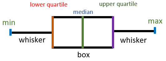
When we plot grouped data on a graph, we have to calculate some basic quantities which help in identifying the trends of the plotted figures. The visualization of the data helps in the identification of outliers, the symmetry of the values, how tightly packed the information is if the data is skewed, and which quantities lie in its quartiles. Some of the common modes of visualizing the data for all the above-mentioned quantities include density plot, histogram, and box-and-whisker plots. The box-and-whisker plot, also known as simply box-plot, is based on five numbers of the data set including upper quartile, lower quartile, median, minimum value, and the maximum value.
Box and whisker plots are typically used to display data on a single variable, where the use of a box indicates discrete categories, and the values within each box are displayed using horizontal and vertical lines. Box and whisker plots can be useful for creating visual summaries which highlight the primary features for comparison. In contrast, dot plots can provide a more detailed view of features but are generally less legible across a wide range of the numerical sets.
This data is hard to visualize without knowing the following: what is the measure x, the range, and the number of data points collected. In this case, we have a set of data called percentage-ages that ranges between 1.0 and 4.0. The number of data points is not relevant because the number of cuts is not significant when the numbers are collected in a histogram.
It can also tell you if your data is symmetrical, how tightly your values are grouped, and if and how skewed your values are. Moreover, it can also give you information about the data set's outliers and their values. There are several unique features of these visualizations that can give us some insight into a collection of data.
Upper Quartile is the value in the data set that lies at the 75th-percentile of the graph and is represented as Q1. Lower Quartile is the value in the set that lies at the 25th-percentile of the graph and is represented as Q3.
The median of the set is the middle value of the entire data. If the data set has an even number of values, then the median value is the average of the two values that lie at the center. If it has an odd number of values, the median value is the one value that lies in the middle of the data.
Use an equal-interval scale and draw a rectangular box. One end of the rectangular box must lie at Q1 and the other end of the box must lie at Q3. The next step is to draw a vertical line at the median value, minimum value, and maximum value.
How to Read Them
To understand the box and whisker plot better, you need to understand quartiles and medians. A median is the mid-point of your data set whereas, quartiles divide the data set into equal parts. These quartiles cover the data in the following way:
The first quartile (Q1) contains more than 25% of the data.
The second quartile (Q2) divides the data in half in the center.
The median is also known as Q2.
Lastly, the third quartile (Q3) is larger than 75% of the total data.
In addition, a box-and-whisker plot, also known as an Inter-Quartile Range (IQR) plot, is where outliers are shown along with the data points. In other words, this interquartile range is the distance between Q1 and Q3. It determines vertical lines that extend the ends of the box. These vertical lines can be named the whiskers. The whiskers are extended to 1.5 times of IQR, and the points beyond that range are marked with a dot as outliers.
There are other ways to identify whiskers in your data. For example, if your data set is symmetric, you can find the median because it will be at the center. The distance between the first and second quartiles is the same as that between the second and third quartiles in an equally distributed data set. Moreover, the outliers can also be easily identified because they will be uniformly distributed on both box sides.
However, this will not be the case if the distribution is skewed. Here, the median won’t be exactly the center point of your data. When it comes to whiskers, you'll observe an imbalance as one side has a shorter tail with few outliers while the other has a longer tail with more.
How to Make Them
A box plot allows you to quickly comprehend data sets with outliers, minimum and maximum values, and group boundaries. It's also used in understanding correlation and outliers for time series data and seasonal changes. If given a data set, following these steps will help you make a box and whisker plot.The first step is to arrange the data set in ascending order, from smallest to highest.
Find mid-value or median in your data. If the data entries are even, the center point is the median, whereas, in the case of an odd sequence, take the average of two middle values.
Find the median for the lower half and then the upper half of your data set.
To construct a box plot, you need to calculate the smallest value, lower quartile, median, upper quartile, and, lastly, the highest value.
Once you have these values, plot these points on the number line.
Make vertical lines connecting the lower quartile, median and upper quartile and thus form a box.
Lastly, draw the whiskers.
When Would You Want to Display Your Data This Way?
Box and whisker plots are a great way to display large pools of data in a nice a succinct chart. This makes it very helpful to display the scores on examinations of tests that many people have taken. For example, the SAT and ACT data is often displayed this way. This helps the test takers to see where their skills were demonstrated as compared to their peers. This method of displaying results is also helpful for anything that has a great deal of change over time because it tends to almost ignore outliers that other charts seem to give you a general sense of. They are really helpful for understanding a population, but they often neglect to communicate individual trials to any extent at all.
Box and whisker plots are a tool that Excel spreadsheet users might be familiar with. This simple graphic shape represents the center of a distribution of data and the upper and lower quartiles or values that divide a distribution into two halves. When you have several data sets from different sources connected somehow, use box and whisker graphs.