Frequency Tables Worksheets
Frequency tables are tools that we use in statistics to help us organize our data and describe the number of times a particular data point appears. These tools usually serve to give you a quick glance at the figures we are working with before you get into deep analyzation of the series as a whole. They provide a great deal of value for spotting outliers and possible inaccuracies in our process. If the vast major of your statistical information is found at a particular scale and you have a single occurrence off in a different direction, we can be quick to discount that points level of significance. These worksheets and lessons will show you how to construct and interpret frequency tables regularly.
Aligned Standard: Grade 6 Statistics - 6.SP.B.5d
- Speed Zone Step-by-step Lesson- Find the frequency of the various speeds of cars in a fixed area.
- Guided Lesson - A really mix of skills: bar graphs, line graphs, medians, and modes.
- Guided Lesson Explanation - The graphs and tallies took me forever to line up properly.
- Practice Worksheet - This data driven worksheets covers a wide array of skills that are particular to this standard.
- Creating Frequency Tables Five Pack - A good way to help kids begin to organize vats of different figures.
- Matching Worksheet - Match the data charts to measure within the field that makes the most sense.
- Answer Keys - These are for all the unlocked materials above.
Homework Sheets
I worked tallies in here as much as I could see. Students will use this a lot in science too.
- Homework 1 - Neil monitored the speed (mph) of the bikes in a particular traffic area.
- Homework 2 - The students received grades out of 60. Draw a bar graph to represent these values.
- Homework 3 - Chip looked back at the number of points Jerry scored in his last two seasons. Find the median number of points that he scored.
Practice Worksheets
The first two are just raw data to chart and graph. The last sheet is filled with tables you need to make sense of.
- Practice 1 - Bonnie was in charge of collecting all of the garbage at each of city's government buildings. The number of garbage bags she picked up at each building can be found below.
- Practice 2 - John recorded the number of burpees he could do in 45 seconds. Draw a line graph to represent the data presented in each case.
- Practice 3 - Find the mean and mode from the following values that you given.
Math Skill Quizzes
These are more data driven problems. There is also a standard on measures of center that pair with this well.
- Quiz 1 - Tracy is counting how many times she can jump rope every day. Prepare a frequency distribution for all this data.
- Quiz 2 - Find the median from the following values that you are presented with. You will be given four charts to work with.
- Quiz 3 - Create a raw bar graph for each large data set. Each graph will need to take into account about 30-40 unique values.
How to Create a Series of Frequency Tables
A significant concept in statistics, a branch of mathematics, is frequency. Frequency is the number of times a value gets repeated in the data set. It is one of the most important elements when kids are learning to display figures visually in the form of histograms, bar graphs, and line plots. The more consistent our results, the more reliable an experiment of any kind is. When organizing data to represent using the visual display tools, you will need to calculate the frequency regularly. We see this in the measures of central tendency.
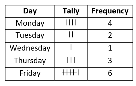
How do we begin to measure frequency on a large scale? Before you start calculating the frequency, you need to know what tally is. A tally is the representation of a single data point using vertical lines. One vertical line represents one count. After the fourth vertical line, a diagonal line is used which cuts through these four lines, starting from the top of the first vertical line and ending at the bottom of the fourth vertical line. This diagonal will then signify that there are 5 data points that share the same value.
Here are the steps to create and use a frequency table to better understand and explain your data. We will list the numbers of bottles of water we drank in a day over the course of 5 days.
Step 1: Construct a Frequency Table - Start by constructing a frequency table with three columns. Label these columns as value, tally, and frequency.
Step 2: Reading - Start reading the data, and for each count, use tally to keep track of how many times a value is being repeated in the stream of values you have. Organize the values in ascending order. Continue the process until you have tallied the entire data.
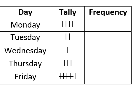
Step 3: Count the Tally - The next step is to count tally to calculate the frequencies. As you will see in our last row (Friday), the cross out indicates a tally of 5.
What Are the Advantages to Visualizing Data?
When we create these graphical representations in the form of a distribution, we can quickly spot inconstancies within the data set. This area of statistics is often referred to as descriptive statistics. This technique could be used to compare multiple data sets and help you easily find outliers that differ greatly from the norm. When you have a visual available, you will have a much greater success level with identifying trends. Using this method, it is simple to spot the minimum and maximum value with a range following in between. By looking at the height of the lines or bars, whatever you choose, you can understand the level of variability in your figures as well. We encourage all students to use visuals when ever possible. While it may not ensure that your solution is correct, it will definitely improve your chances.